Traffic jam
Visualisation of traffic jams
All car owners have experienced traffic jams. However, only from inside their vehicles. What actually happens on the road? Here we show real traffic data on a rather bad day.
Traffic speed image
The figure shows a stretch of 20 km highway, on one afternoon, and in a single driving direction. The traffic from multiple lanes is averaged to effectively a single lane.
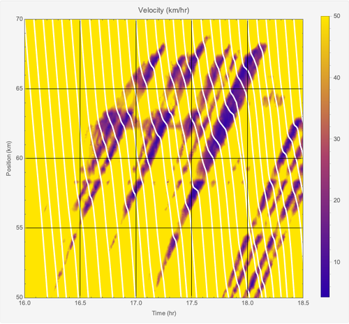
The colours show the traffic speed at a given position and time. The white lines indicate the flow of cars, which move from top to bottom.
A car entering the figure at the top left corner (time 16.0 hrs, position 70 km) leaves the figure at the bottom (time 16.2 hrs, position 50 km), as indicated by the left-most white line. There is no congestion and its average speed is about 100 km/hr. The constant slope of the white line illustrates this. The yellow background indicates all speeds above 50 km/hr of free flowing traffic.
A car half an hour later (time 16.5 hrs, position 70 km) drives into a few sections with reduced speeds, indicated in purple. Then the slope of the white line becomes flatter. The car leaves this section of the highway at (time 16.8 hrs, position 50 km), and its average speed was about 67 km/hr. And so on.
The areas of higher densities start near the bottom of the figure and move upwards. This shows that a congestion moves against the traffic direction, at about a speed of 18 km/hr. The congestion resolves again near the top of the figure.
Data Source
Private traffic data.
Copyright
© 2019 Bontekoe Research, Amsterdam. Partner in NARMA42.